Pastels or Brights is your quest at

I tend to lean towards brights. I have definitely mentioned it before but back in the 80's I joined a group of colleagues from work in having my "colours done". Winter I was, apparently the only season able to wear black successfully, with a touch of Autumn thrown in for good measure. . Anyway, I digress, my colour palette included bright clear colours and, to this day, I still carry my swatches (on the rare occasion when I am looking for anything other than riding gear!!) when clothes shopping. So in a long winded round about way, that is why I choose brights!!
If you are still with me, here is my card
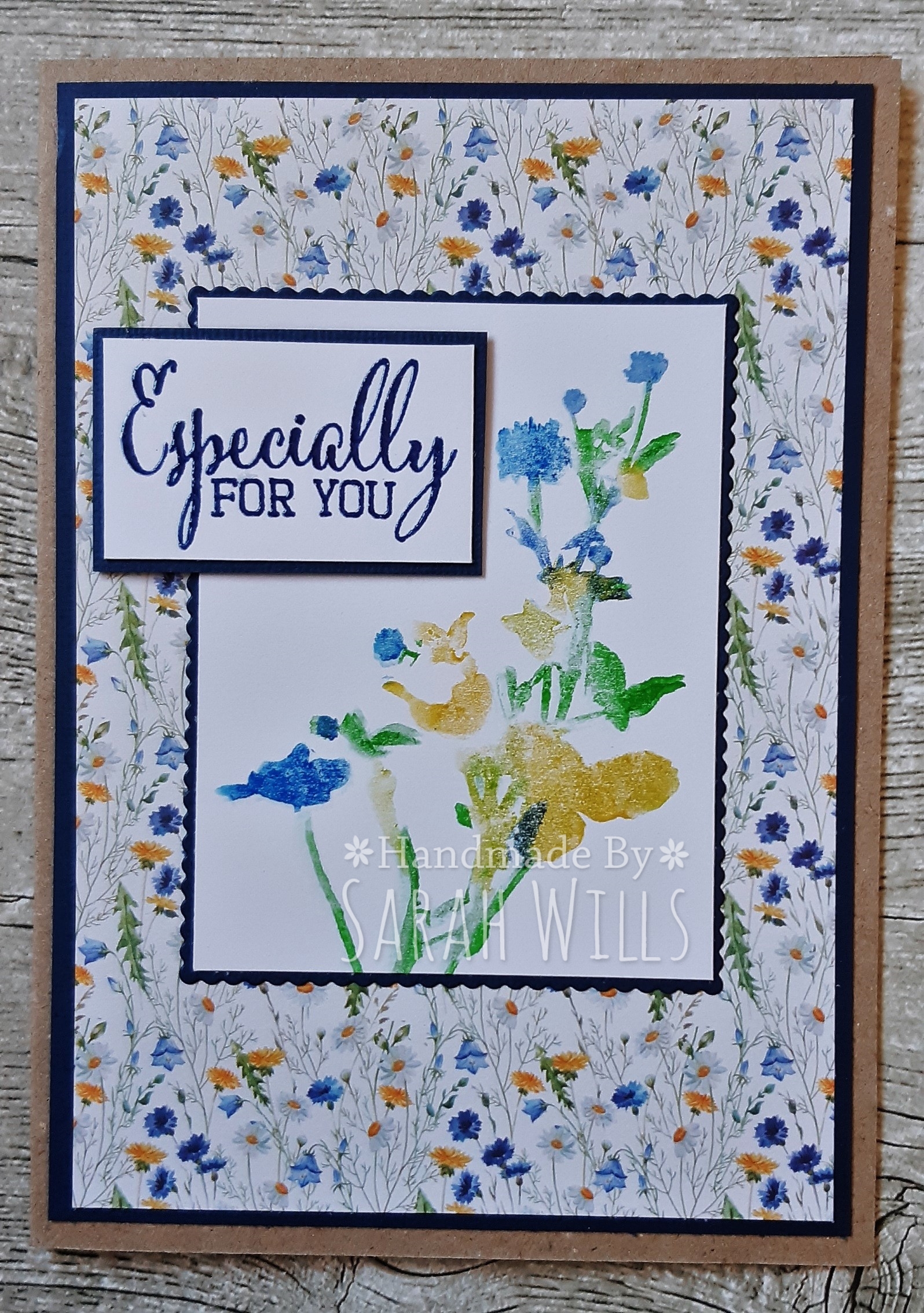
The gorgeous paper (The Range) was the starting point, I just love those bright yellows and blues. I found a stamp in my stash that was an Allsorts win and, using my Stamp Perfect, inked direct to the stamp to achieve the watercoloured look I was after.
I hope you will take inspiration and join us.
See you again on Saturday xx
Wow what a stunner, Sarah! I'm a bright colours type of gal myself! xx
ReplyDeleteLove the way you've matched the DP to your central panel Sarah. Second silage started across the way yesterday!Didn't think it would have grown enough as we've not had a mm of rain in weeks! :)
ReplyDeleteI love this so much! Your stamping mirrors the gorgeous paper beautifully.
ReplyDeleteSuch a bright and lovely card Sarah love that paper hugs Sue x
ReplyDeleteBeautiful card Sarah, love that paper and you've matched it perfectly with your stamp x
ReplyDeleteYou found the perfect combination of paper and stamp and created a wonderful card,I love bright colours too
ReplyDeleteA fab match of papers and image colours. Elaine
ReplyDeleteThis is gorgeous Sarah, love the pretty papers and bright colours.
ReplyDeleteLorraine x
Beautiful card Sarah. I love the bright blues and yellow paper and your lovely stamping. ( I too am a winter and yes my closet reflects a lot of black, pure white and bright colours) hugs, xx
ReplyDeleteAll things bright and beautiful Sarah, gorgeous flowers and papers and beautiful card..
ReplyDeleteLuv CHRISSYxx..
Gorgeous, gorgeous colours Sarah.
ReplyDeleteB x
This is so pretty and a superb card showcasing those bright colours.
ReplyDeleteLorraine
Gorgeous paper and colors.
ReplyDeleteGosh that watercolour effect with your stamping matches the paper so beautifully! A stunning card hun! I think I was a Spring when I had my colours done, but have gravitated towards the Autumn colours all my life! Hehe. Not sure what that says about me! LOL. Hugs, Wends xoxo
ReplyDeleteWow, Sarah, this really appeals to me! I love the watercolory look of your stamps and it couldnʻt go with the paper more perfectly.
ReplyDelete